はじめに
カルーセル関係のプラグインは、 JQueryプラグインの中でも数多くおり、サイトのイメージにマッチする カルーセルが見つからないこともありますが、今回はレスポンシブ&スワイプ対応のカルーセルプラグインのOwlCarouselを試してみます。

2014年03月22日 20時45分
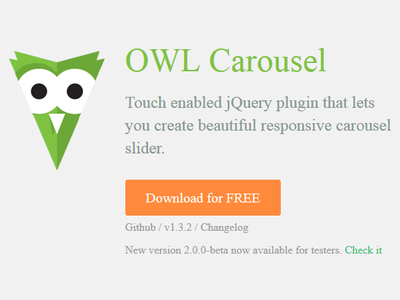
カルーセル関係のプラグインは、 JQueryプラグインの中でも数多くおり、サイトのイメージにマッチする カルーセルが見つからないこともありますが、今回はレスポンシブ&スワイプ対応のカルーセルプラグインのOwlCarouselを試してみます。
作業の前提条件は、下記のとおりです。
| ソフトウエア | バージョン |
|---|---|
| OS | Windows 7 Ultimate 32bit |
| Cygwin | Setup Version 2.831 |
設置に必要なアーカイブをダウンロードし、解凍します。
$ cd /tmp/demo
$ wget -q https://github.com/OwlFonk/OwlCarousel/archive/master.zip
$ unzip -q master.zip
$ rm -f master.zip
$ cp -r OwlCarousel-master/owl-carousel .
owl.carousel.cssおよび、owl.theme.cssを指定します。
<link href="owl-carousel/owl.carousel.css" rel="stylesheet">
<link href="owl-carousel/owl.theme.css" rel="stylesheet">
jquery.jcarousel.jsを、HTMLファイル中に指定します。 追加します。
<script src="jquery-1.10.2.min.js"></script>
<script src="owl-carousel/owl.carousel.min.js"></script>
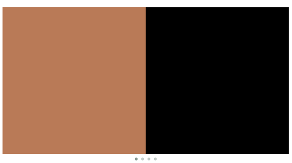
Bootstrap 3で画像のカルーセル機能を試して見るで使用したイメージを使用して、表示するコンテンツを作成します。
<div id="example" class="owl-carousel">
  <div><img class="img-respontive" src="img/023-01.png" alt="01"></div>
  <div><img class="img-respontive" src="img/023-02.png" alt="02"></div>
  <div><img class="img-respontive" src="img/023-03.png" alt="03"></div>
  <div><img class="img-respontive" src="img/023-04.png" alt="04"></div>
  <div><img class="img-respontive" src="img/023-05.png" alt="05"></div>
  <div><img class="img-respontive" src="img/023-06.png" alt="06"></div>
  <div><img class="img-respontive" src="img/023-07.png" alt="07"></div>
  <div><img class="img-respontive" src="img/023-08.png" alt="08"></div>
</div>
OwlCarouselのロードを行うJavaScriptを追加します。
ここでは、スライドショーを実行し、一度に表示される画像の数を2に指定しています。
<script>
  $(document).ready(function() {
    $("#example").owlCarousel({
      autoPlay: 3000,
      items: 2
    });
  });
</script>
ページを表示し、ブラウザの幅を狭くすると、レスポンシブ対応が確認できます。

<!DOCTYPE html>
<html lang="ja">
  <head>
    <meta charset="utf-8">
    <!--[if IE]>
    <meta http-equiv="X-UA-Compatible" content="IE=edge">
    <![endif]-->
    <meta name="viewport" content="width=device-width, initial-scale=1">

    <title>050</title>

    <link href="bootstrap.min.css" rel="stylesheet">
    <link href="owl-carousel/owl.carousel.css" rel="stylesheet">
    <link href="owl-carousel/owl.theme.css" rel="stylesheet">

    <style>
      body { margin-top:100px; }
    </style>
  </head>

  <body>
    <div class="container">
      <div class="row">
        <div id="example" class="owl-carousel">
          <div><img class="img-respontive" src="img/023-01.png" alt="01"></div>
          <div><img class="img-respontive" src="img/023-02.png" alt="02"></div>
          <div><img class="img-respontive" src="img/023-03.png" alt="03"></div>
          <div><img class="img-respontive" src="img/023-04.png" alt="04"></div>
          <div><img class="img-respontive" src="img/023-05.png" alt="05"></div>
          <div><img class="img-respontive" src="img/023-06.png" alt="06"></div>
          <div><img class="img-respontive" src="img/023-07.png" alt="07"></div>
          <div><img class="img-respontive" src="img/023-08.png" alt="08"></div>
        </div>
      </div><!-- row -->
    </div><!-- container -->

    <script src="jquery-1.10.2.min.js"></script>
    <script src="bootstrap.min.js"></script>
    <script src="owl-carousel/owl.carousel.min.js"></script>
    <script>
      $(document).ready(function() {
        $("#example").owlCarousel({
          autoPlay: 3000,
          items: 2
        });
      });
    </script>
  </body>
</html>